Our automobiles are getting three makeovers simultaneously, with promises of a fourth. There is more action in reinventing of automobiles all at once than there has been since the first ones crawled into existence.
First, our cars are turning electric, and the UK recently said that no new gas or diesel automobiles will be allowed on the road starting in 2040. Don’t be surprised to see more countries and states (e.g., California) follow suit.
Second, our cars are getting more driver assist features with lane change and backup audible warnings, automatic parking and lane changing, new forms of smart cruise control, new bumper-to-bumper traffic control options, etc. These are level 1 and level 2 autonomy (see my blog post from earlier in the year), with level 3 starting to show up just a little, and overly enthusiastic predictions of levels 4 and 5 (again, you can see some of my thoughts on how I think that is further off than expected).
And third, we are getting new user interfaces in our cars, and that is the subject of this short post.
I drive a lot of different rental cars during any given year, so even though my own car is now eleven years old I get exposed to a lot of the new interfaces that are appearing in very standard level compact cars.
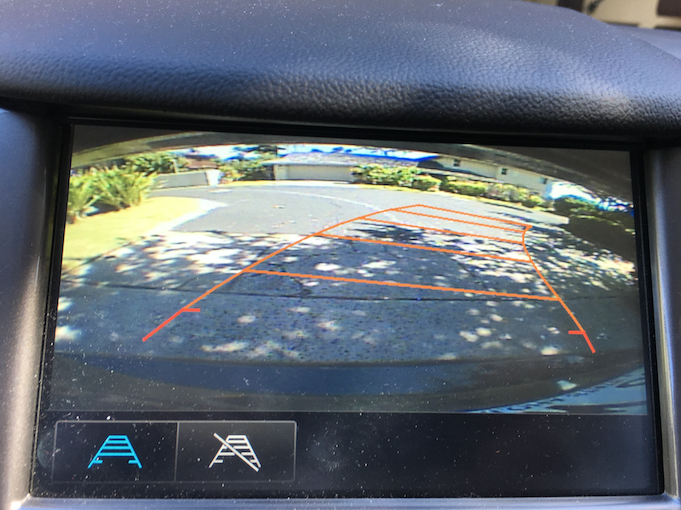
I’ve been driving the same rental car for two weeks as of today, and there are some things I really like about it. Most cars I have rented over the last two years have had a backup camera that has a live image on the LCD screen in the center of the dashboard. This is great, as it is usually a much better view than can be had by scanning all three rear view mirrors. The better versions of this feature show you an overlay of exactly where the car will go as you backup with the current setting of the steering wheel. Here is a view from the screen in my car this morning:

This is so much better than a plain old rear view mirror. It shows me exactly what I might hit as I back up, and for me that is especially useful in a parking garage as I am just so great at hitting things while going backward…
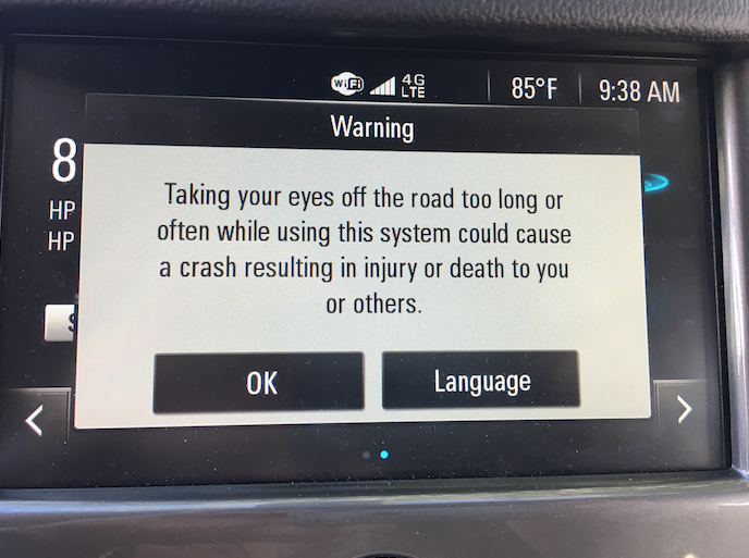
But it is not all champagne and roses. After having this car for two weeks, twice this morning, while I was driving along the street, the following window popped up on that same screen, which is a touch screen, by the way:

How can this be a good idea, or a good User Interface feature? It could lead to a very bad User Experience! A window pops up to tell me I shouldn’t take my eyes of the road to deal with the interface. That is a good message. But not while I’m driving! Both times it made me take my eyes off the road to read what this warning was about, and then I needed to reach out and servo my finger to the “OK” virtual button to dismiss it. It was a real temptation to do it while driving. Exactly the thing it is warning against!
Bad UI. Potentially disastrous UX.
This reminded me of an interchange I saw on Facebook right after the newest Tesla came out. Someone complained about the lack of dials and knobs, and so much of the UI being put on the very big LCD that is in the middle of a Tesla dashboard. Another person chided that person, saying essentially, “get over it, we now live in the world of the iPhone, not the Blackberry”.
I thought that latter comment completely missed a real issue. The knobs and levers with their fixed positions and fixed meanings within any particular car, along with the tactile feedback that they give us allows us to do a lot of control operations without taking our eyes off the road at all. That is a very good thing until the task of driving is completely taken over by the car itself. We need our attention out on the road. Moving control functions, that are needed while in motion and while controlling the car, to a touch screen, is probably not a good idea. Being able to do things without using our eyes is a safety feature while driving (and while walking with an iPhone…).
[By the way, why do our turn indicator blinkers make a clicking sound? Because the original ones that were introduced in the 1950’s operated by running a current through and heating up a bi-metallic strip. As it heated up it bent until it hit a contact, hence the click, which then drained the current to the indicator lights on the left or right side of the car, allowing the bi-metatallic strip to cool down and repeat. Now cars simulate that same old clicking sound so that we know when the indicators are blinking.]
I suspect that we are all going to be guinea pigs over the next few years with auto-makers bringing out some really great new UI features, along with some real failures.
Be careful!!


The brightly colored picture you’ve posted of your backup camera screen beats mine which is either poorly lit or in need of improved contrast. It gives me a fairly gray image of anything behind my hybrid. I’ll admit I’ve become accustomed to the repeat beeping if a vehicle is parked across the “aisle,” but it took a while. My car cruises around without engine noise, but when the safety features are set, it’s pretty aggressive about beeping in anticipation of a collision or line crossing. I like that they combine that with brightly colored warnings on the dashboard.
Safety features are improving. What is hard to believe is that car horns aren’t set to blare whenever someone leaves their baby strapped in a carseat in the back of the car! With technology, there is NO excuse not to incorporate a siren feature in car seat design.
Your perspective is spot on, I hope that those who design the cars UI/UX get to read this and think about more clearly about what the experience is like from the driver’s perspective.
One thing that self-driving car designers don’t seem to think about, though, is the fact that one of the things people love most is control. They want to design a car that takes control away from people, so that they can ignore their environment and do other things. I suspect that a whole lot of people out there simply won’t want that. What is useful, on the other hand, is features such as that backup camera – it gives you information that you wouldn’t have otherwise, but you’re still in charge is using that information, it doesn’t take away your agency.
Did you happen to have experiences with cars that park automatically? Can you compare the feeling of being able to park the car perfectly on your own (with the extra view) vs. sitting there while the car does it for you? I suspect that some people would really love how they don’t have to do the work, but many others are likely to have some preference for the “I do it!”, and would rather not having to trust the software. For those people, cars that give them more information, especially raw sensory information (like your ticking sound example), would probably help them become much better drivers, without ever having to drive for them. After all, some people just love the feeling of driving…
I’m getting old and slow. Not yet /too/ old and slow, but I can see the writing on the wall. Ten years from now, I’m guessing, I would be a menace behind the wheel of a human-controlled car. I /can’t wait/ for cars to take control away from me. (Don’t tell me about Uber. I hate Uber. Uber is evil.) Today, I can’t quite afford a Tesla. but my Ford Fusion Energi Titanium does a pretty good job of parking and driving itself. It’s not hands-free (except in the self-parking mode) but it watches the lane markings and it watches the things in front of me, and it beeps loudly if it thinks I’m about to hit something. (Occasionally it has false positives, when I’m turning to avoid an obstacle without slowing down.) I don’t know how I lived without adaptive cruise control! The first time I drove a car with adaptive cruise control gave me the same tremendous feeling of empowerment I got when I bought my first Swiss Army knife.
Everybody is all bent out of shape because a Tesla had /one/ accident. How many human drivers have had accidents since the first Tesla? I think they should outlaw human drivers right now!
Hi Brian! Long time no see.
Eventually we will get rid of all human drivers (except in recreational isolated locations). But that may not come quite quick enough for either you or me.